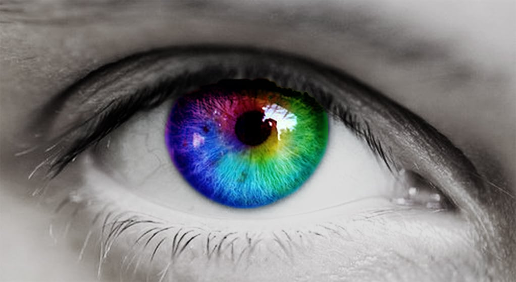
Does colour rhyme with emotions? Is our way of interpreting hues and materials that simple?
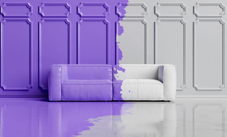
The interaction between colour and materials often plays with our perceptions. Depending on their properties to reflect, absorb or emit light’s electromagnetic rays, materials show us a colour that we perceive and judge either pleasant or repulsive.
This appreciation is a multi-sensory reaction: colours and materials complement one another or go their separate ways in the image that we perceive: a bright and “vibrant” yellow will appear different if we evaluate it based on a lustrous surface or a matte and granular material. A crimson seems even “deeper” (which is to say dark) when it is found in materials that offer a soft and comfy texture such as velvet, felt or wool. Without forgetting “electric” blues or soft hues (as if we were caressing them)… The perception of a product that we have is in some ways an interpretation that mixes sight and touch