KALYTERA

We guarantee quality, functionality and style. Indulge in feeling good!
Cotting has been committed to developing a new, innovative range of products particularly suited to the world of health and care. As its Greek name implies, our goal is ensuring that you enjoy the best quality both in terms of functionality and style.
According to the WHO, 3 types of well-being combined (physical, mental and social) are a key factor in enjoying long-term good health. The search for well-being is becoming more holistic and affects all generations.
In response to this need, medical professions are joining forces to offer all-round patient care. Traditional and progressive systems of treatment are starting to consider alternative care therapies, including the practice of sport, art or meditation – all of which contribute to the promise of ‘living better for longer’.
Spaces are being designed to be more welcoming and less sanitised. In this way, aesthetic codes are changing and adapting to the new values expected by patients.
For KALYTERA, we have focused on 16 colours in particular. These have been divided into 4 themes according to their intended use. The thinking behind this is that colour is the most widely shared and most easily understood universal symbol with which everyone can identify
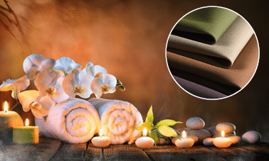
NATURALITY
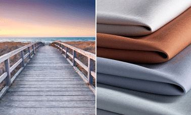
HORIZON
As the world becomes increasingly urbanised, the trend is to associate well-being with nature. In response, material manufacturers are competing with each other creatively by putting forward eco-aesthetic solutions. As a result, there is a strong trend for ‘natural Zen’ spaces.
KALYTERA is part of this current fashion in that it offers a range focusing on natural colours. The warm, comforting hues go perfectly with all environments which emphasise authentic materials.
4 colours which combine well with light colours:
The colour Figue is new. It brings an air of sophistication to the more traditional colours in the range and enhances all the other hues.
Muscade brings a new twist to the warm tones of wood and leather.
Liège is the new must-have, warm neutral shade which will calm or enhance strong colours.
Finally, Thym green – a shade of plant-inspired well-being – completes the palette of greens so popular in living spaces
The desire to take a break and gaze into the distance is growing, much like the craving for calm and deep breathing in order to better reconnect with the elements and earth energies.
The new airy pastels radiate good vibes and a more relaxed way of life. Reassuring and calm, they foster a feeling of optimism.
Opaline – mineral purity and a moon-like colour which encourages relaxation and meditation. Ideal for all places dedicated to well-being.
Ozone – an inspiring colour somewhere between blue and grey. Soft and energising, this colour is perfect for combing with other shades as it is always enhancing.
Crépuscule – a flamboyant orange reflecting the sky at sunset. Used as pops of colour, it warms up more muted hues with its energy.
Calcaire – an essential off-white for complementing all colours. It brings a feeling of restraint and a timeless vibe.
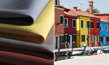
BOLDNESS
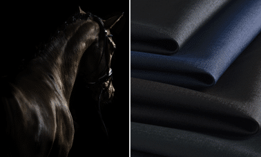
SOPHISTICATION
An ideal range for creating clear, memorable visual signage and energising spaces.
This contrasting range of cool, atmospheric hues and warm, spicy colours is your solution for defining areas and breaking traditional codes.
Paprika– a spicy red which is immediately noticeable but not aggressive. It is perfect for breathing life into a space.
Zéphyr– this taupe grey adds a hint of elegance which tempers and enhances the warm colours.
Citron yellow brightens all hues and can be used as a pop of colour to make dark or neutral colours more dynamic. It can also be used for an overall look to create an invigorating environment.
Orage– a grey blue which creates a contemporary vibe. It can be used to balance the boldness of the warm hues or be toned with « Zéphyr ».
Everywhere there is a need for reassurance. More than ever, expertise must be presented in a serious manner to provide reassurance.
The power of this range of dark tones lies in the fact that it is both very modern and very timeless. Its sophisticated vibe and subtle sheen enhance its feeling of quality.
vert Titien refreshes the palette of dark greens. Its charm will appeal to designers and it will fit in with any well-maintained space.
Ebène, for a tone-on-tone interplay with dark woods, or in contrast with metal.
Minuit – this dark blue has replaced black in the fashion world and is following its success in the world of interior design.
Jais – a black which shimmers with an unmistakable contemporary minerality and exudes competence and good taste.